#57c Land Rover Fire Truck different labels
Re: #57c Land Rover Fire Truck different labels
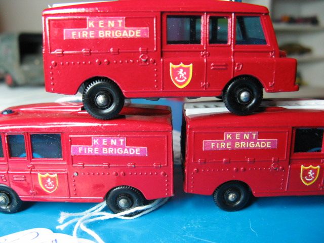
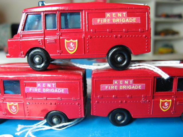
For everyone's consideration. Please note the labels on these pictures. Very similar to the one that Dan has shown.
I truly love pressmen. They never get it right. At least the registration looks good.
Jeff
I truly love pressmen. They never get it right. At least the registration looks good.
Jeff
- Attachments
-
- $_57 (1).JPG (100.37 KiB) Viewed 1606 times
-
- $_57.JPG (146.14 KiB) Viewed 1606 times
Re: #57c Land Rover Fire Truck different labels
Christian, you have tended to call many of the odd plastic colors we have found and mentioned on the Forum as 'Sunfade'. This may be your experience from years of looking at beaten old used Toys at shows that have been exposed to all kinds of environmental conditions. Those models with labels that have been in the hands of collectors like myself for over forty years are pretty hard to raise winning arguments over. If you are to dispute my firsthand note of Brad's color label being featured when these 57 Fire Trucks were fresh in their factory boxes, that is fine, I'll accept that. I find this quite curious though. The point of my answer to Brad's Post was quite clear, I have several examples of Brad's color labels that I have owned for 37 years now since new. You are quite correct about the lettering also being near-white, but that is the way these particular labels came off the press. The last version of the #20 Taxi I also commented on in my Post earlier here was delivered with a very odd lighter colored yellow factory label with the same white lettering as Brads Fire Truck. That is why I compared the two models. I have the Taxis with those labels brand new and boxed as spares because of that odd label, no sun exposure ever.
Christian, Your expert opinion of 'Sunfade' has already caused Taniwha to comment that 'The red slide is nice anyway Brad', and also Brad to come forth with the fact that he has other labels quite similar to this one, but perhaps not as dramatically different in both colors. I commend Brad for sharing his Fire Truck with the two different side labels that I am intimately familiar with. Just as on Hardy's fake 23C Caravan with stolen glaze, Christian and I simply have a difference of opinion, nothing more, nothing less. It happens in life. kwakers
Christian, Your expert opinion of 'Sunfade' has already caused Taniwha to comment that 'The red slide is nice anyway Brad', and also Brad to come forth with the fact that he has other labels quite similar to this one, but perhaps not as dramatically different in both colors. I commend Brad for sharing his Fire Truck with the two different side labels that I am intimately familiar with. Just as on Hardy's fake 23C Caravan with stolen glaze, Christian and I simply have a difference of opinion, nothing more, nothing less. It happens in life.
Re: #57c Land Rover Fire Truck different labels
Kwakers is correct about Brad´s label, in this case it isnt sunfade,its a case of no yellow ink applied to that sticker, which should have been under the red.
- Brad Pittiful
- Posts: 1265
- Joined: Sun Sep 15, 2013 5:03 pm
- Location: The Tardis
Re: #57c Land Rover Fire Truck different labels
i took a couple more pics of the two other models with purple-ish labels...these are mint in F type box models
the two on the bottom have purple-ish labels on one side and reddish on the other...the one on the top has both labels that are purple-ish...not as purple as the two bottom models...but the top models labels are not the normal red we are used to seeing


the two on the bottom have purple-ish labels on one side and reddish on the other...the one on the top has both labels that are purple-ish...not as purple as the two bottom models...but the top models labels are not the normal red we are used to seeing


Please use a web hosting site (like photobucket) to store pictures so you can post them here, using attachments makes it hard to view the pictures when you have to scroll to see them. Seeing comparisons of models is hard to see with attachments too.
Re: #57c Land Rover Fire Truck different labels
Dan, Dick and Christian,
I apologise if my earlier post was ambiguous, or offended anybody by implying that I have an opinion on the colour of the labels on this model. I genuinely wanted to record here my opinions about the colour of the base slide, which was, after all, the reason that Dan purchased the model in the first place.
Allow me to attempt, hopefully with more success than before, to explain my opinion (or lack of it) regarding the colour of the labels.
In this part of the World, the ozone layer in the upper atmosphere is significantly thinner than it is in Europe, Asia and much of the Americas. Local collectors are therefore used to seeing varying degrees of sunfade resulting from even relatively short exposure to the UV rich sunlight here.
Further, as a student of Art, and a part-time collector of artworks, including works on paper, I am acutely aware of the potential for damage that can be caused to works on paper by environmental conditions. That includes of course the impact of UV light, but is by no means limited to that - relative humidity, the presence of cigarette smoke etc. can also cause damage to printed paper, plastics and even paint on metal toys.
On the other hand, as we know, paints and inks are difficult to mix consistently over time with respect to colour. So, aside from Dick's provenance of having actually purchased such items new (which I do not doubt), I am just as prepared to accept that this item left the factory this way as I am to believe that it has faded in the sun or suffered some other damage caused by environmental factors over time.
Because I have reasonable doubt that this label colour was the result of a deliberate choice made by the manufacturer, I feel that at best, this should be considered a "negative variation". So, finally, I return to my initial statement that it is a nice model to own on account of the colour of the base slide. The bonus for me is that we have been able to enjoy this lively debate about the label colour.
Cheers,
Gavin
Faceless Bureaucrats have feelings too...
Re: #57c Land Rover Fire Truck different labels
I like Mick's theory of no yellow ink on the 'odd' labels, but to take that a step further, could the basic color of the sheet used to make these labels been a basic white, versus the normal yellow color adhesived stock the normal run were printed on? It seems that you would want to print only one color if you could, not both when you are manufacturing these labels.
I guess we need a bit of education from an experienced printer on this one, but that appears now to be the answer. I can dig into the 'beater box' to inspect the backside of these labels, and maybe dissect one for it's 'unprinted' base color. We never gave these labels any thought at all when they were brand new, we simply put them on our shelves and in our spares as just another variation. The old Matchbox Guides by AIM and NAMC Clubs frequently reported the various distinct shades of factory labels and printing on them, such as on the 74 Daimler Bus, and on the #20 Taxi, but missed this 57 Fire Truck's labels.
Bob in his NAMC Guide did document the factory colors on the #20 Taxi labels as being pale yellow, yellow, dark orange, light yellow, orange, and WHITE. This would indicate different colors of label stock, just as with Mick's idea. Bob's White label version (that is also last on his list of variations) is in canary yellow, and can have either light or dark red letters on it. That sounds just like the difference in reds we are also noting on this 57 Fire Truck 43 years after his NAMC Guide was written. A 'lively debate' as Taniwha has called it, backed up by known documentation from the 'stoneage Bibles of Lesney collecting'. Caveman kwakers
-
GHOSTHUNTER
- Moderator
- Posts: 12249
- Joined: Sun Sep 15, 2013 4:12 pm
Re: #57c Land Rover Fire Truck different labels
PAPER LABELS NOTES...
Having some screen printing experience, I can relate some information that may fit in with those Lesney applied paper labels. Studying closely the labels themselves, it is fairly certain they were printed by the 'Screen Printing' method and I believe the base label card (lightly compacted paper with single sided adhesive), will be plain to start with, it would then pass through the printing machine for one colour, possibly then passed through a quick drier, passed through the printing machine again for the second colour and then left to dry. The system used by Lesney at that time was probably no more technical than a basic screen printing machine, auto or manual, able to lay down several dozen images of the desired design, in this case...KENT FIRE BRIGADE...on a sheet close to A4 size, the main background colour is laid down first, RED, then the YELLOW is laid down second and hopefully in register with the un-printed areas, left blank in the background RED. You can not really print the yellow on top of the red, it will make the yellow too dark (although in this case it might not have been a bad thing!), so the yellow has to be printed directly onto the plain card background.
Mix the yellow ink too thinly and the result will be a washed out colour. Mix the red in a container not cleaned properly from the last colour and it won't be red but a shade of whatever colour was mixed in it previously!
Thinly mixed inks will appear to fade more, thick ink won't.
Maybe the sheet of labels was printed with an off-shade red, but because the labels were only going to be used on a toy vehicle, it did not warrant scrapping them and having them all done again.
I was a screen printer for the 'Petro-Chemical' industry during the Eighties, working to international 'ISO' Standards and the screen printing technique is the same in all industries, and still in use today.
GHOSTHUNTER.
- Brad Pittiful
- Posts: 1265
- Joined: Sun Sep 15, 2013 5:03 pm
- Location: The Tardis
Re: #57c Land Rover Fire Truck different labels
very interesting theories guys! all i know is...some look purple and some look red...im just going to keep it simple 
Please use a web hosting site (like photobucket) to store pictures so you can post them here, using attachments makes it hard to view the pictures when you have to scroll to see them. Seeing comparisons of models is hard to see with attachments too.
Re: #57c Land Rover Fire Truck different labels
Didn't we have a thread on the old forum about white rather than yellow text on these labels?
- Brad Pittiful
- Posts: 1265
- Joined: Sun Sep 15, 2013 5:03 pm
- Location: The Tardis
Re: #57c Land Rover Fire Truck different labels
nothing was saved from there...so i think we'll be rediscussing many topicsIdris wrote:Didn't we have a thread on the old forum about white rather than yellow text on these labels?
Please use a web hosting site (like photobucket) to store pictures so you can post them here, using attachments makes it hard to view the pictures when you have to scroll to see them. Seeing comparisons of models is hard to see with attachments too.